Rukisan - LyCORIS LoCon - Pony/Illustrious


Details
Download Files (1)
About this version
Model description
LoCon trained on Rukisan's artstyle for Pony V7 and Illustrious 0.1
Artist: https://www.pixiv.net/en/users/94208188
Check the "About this version" section for any quirks or pitfalls I'm aware of or have experienced.
Some Q's:
What's your workflow? (Pony)
Sampler is used with restarts with segments [3,2,0.06,0.30]
The scheduler used is Karras
Initial resolution is selected from the SDXL whitepaper appendix I: https://arxiv.org/pdf/2307.01952
Upscaler is usually 4x_fatal_Anime_500000_G or 4x_NMKD-Siax_200k, with this one in particular upscaling with lanczos also yields acceptable results
Second sample pass is the same as the first (params are on civit's meta interface) but at ~.35-.45 denoise
A facedetailer is used
What's your workflow? (Illustrious)
Sampler from images is done with nothing special
No special scheduler is used
Conditioning is split (A1111 BREAK) into 3 parts, generally BG and camera/Subject Face and attributes/Subject body and clothing
Initial resolution is selected from the SDXL whitepaper appendix I: https://arxiv.org/pdf/2307.01952
Image is upscaled by 1.5x using Lanczos resampling
Second sample pass is the same, but at around 15 steps at .4 denoise
A facedetailer is used after the upscale
What strength should I be using? (pony)
Base Pony: From my limited testing ~.8 - 1
Autismmix: ~.6 - 1
Other Pony merges: Depends on merge lora compat, but around autismmix levels should work
What strength should I be using? (Illustrious)
Lora-compatible merges are fine at .8 - 1
Otherwise ~.8 or lower
Sample images Model?
All Pony images are Autismmix_confetti
Illustrious images missing the model are cocoIllustriousNoobai_v56
What does your filename structure mean?
It's split into 4 parts of [XX]-MAnon-[YYYY]-[ZZZZZZ]
[XX] - Artist initials
MAnon - My moniker
[YYYY] - SD version and Model version (Ex. XLV4.1 is on SDXL [Not 1.5] and it's version 4.1 of the model, XLILLUS means illustrious specifically)
[ZZZZZZ] - The epochs, only useful to me
Explanation of Issues:
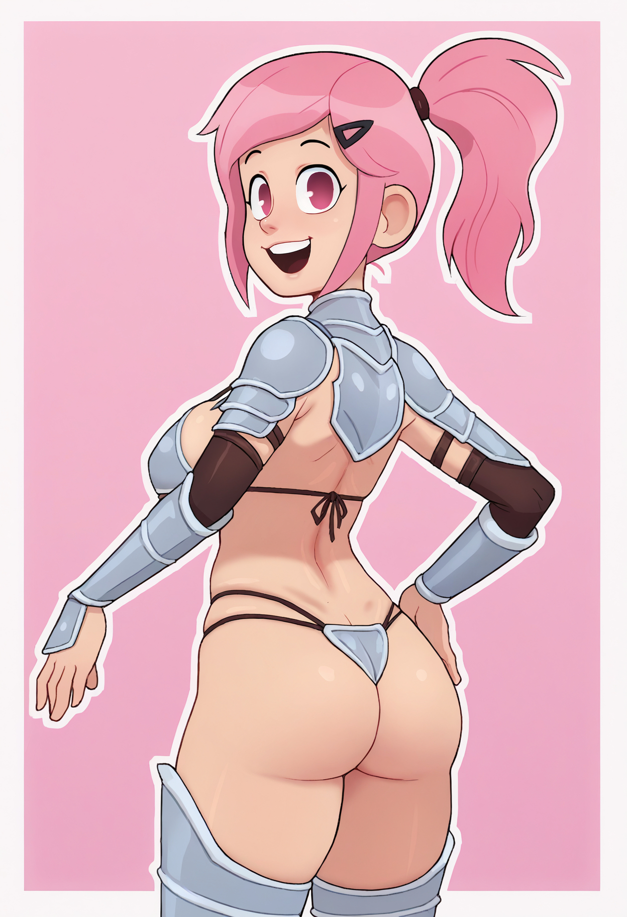
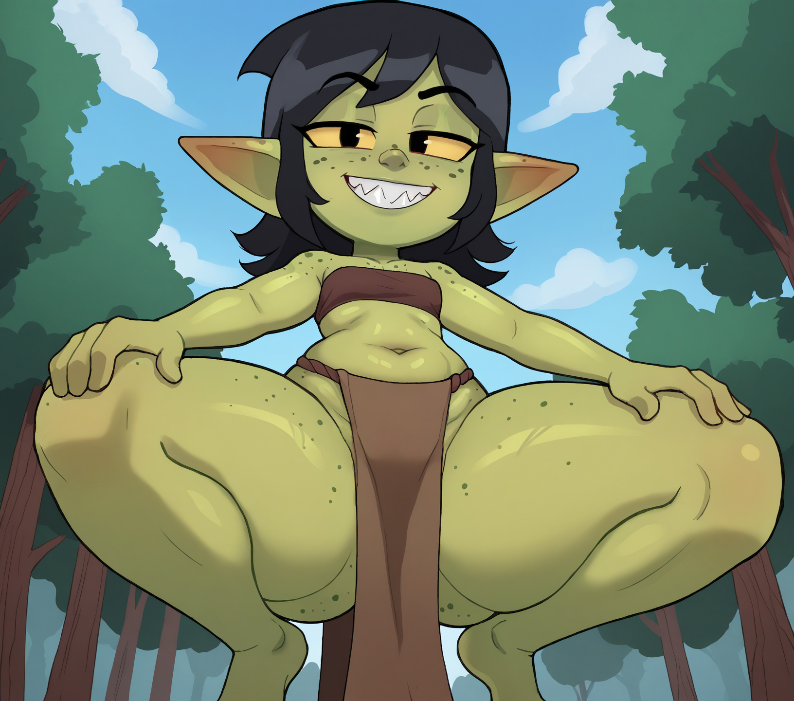
Western cartoon influence
The artist tends to draw all characters with big heads and expressive faces, even including ones that should really not. As a result this training tends to lean strongly towards big heads. You can partially remedy this by using "chibi" in the negs at 1+ weight but it's pretty baked in and my attempts to caption it out haven't been successful.
Jagged, crusty linework (seems fixed on Illus version)
For the most part the linework is satisfactory, but at points it can be uneven, lumpy, or have inconsistent coloring. I always recommend upscaling, but for this one in particular I recommend upscaling. Tiled upscaling also smooths it out more than usual so it may be something to consider. I think it's the result of downscaling the training images but there's only so much I can do about that with the free time I have.
Issues with angles
If you're doing from above/from below/high-angle/low-angle weigh them higher than usual, even then it'll probably fight you
Facial linework has a slight white outline
Sometimes the lines around the eyes/mouth I've noticed will have a white tinge around them, which is exacerbated by upscaling beyond 1.5x scale. They're usually easily fixable in paint/ps with a stamp tool but other than than it's something you'll have to live with.