Chaos Illustrious


Details
Download Files (1)
About this version
Model description
Update v3.0 is out. yada yada copy posta from v2 vs v1 but v3 vs v2 etc.
I recomend CFG 2-4
CFG 2 is more realistic, but also vibrant.
CFG 3 gets pretty interesting with glowing and effects.
CFG 3.5 goes a bit crazy.
CFG 4.5 gets its crap back together and starts acting normal.
(if you cannot zoom in on this image, open it in a new tab.)
I have been using around 10-20 steps, 15 should be more than good.
If you use Hires Fix, i would recommend 5 steps then work your way up from there, but generally 6 and above feels "over exposed".
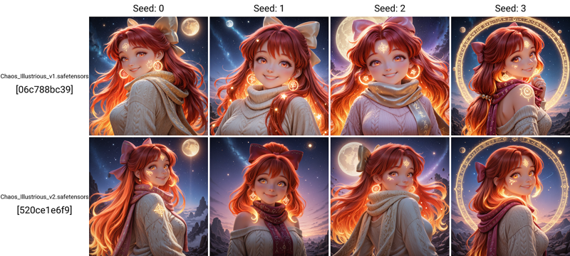
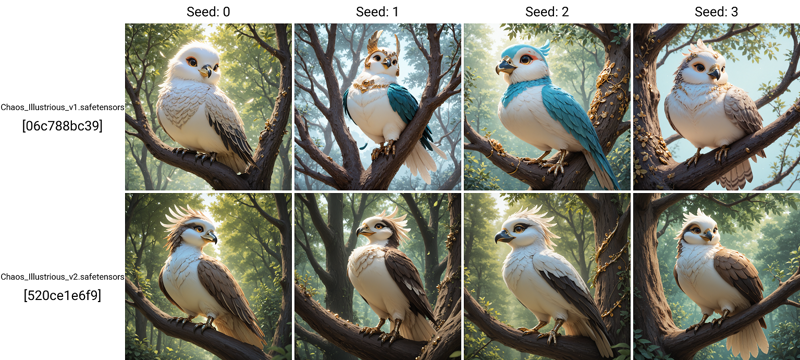
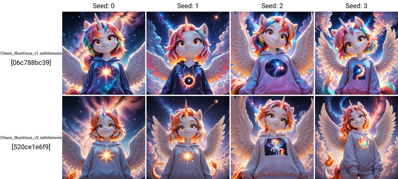
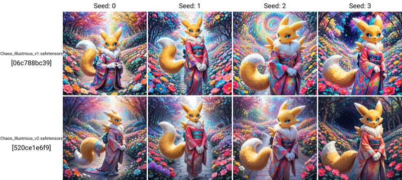
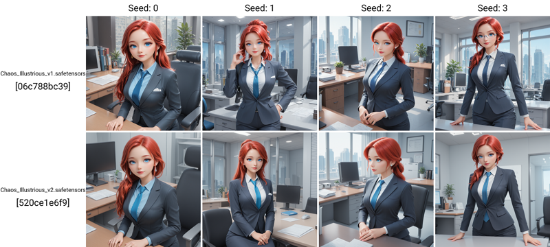
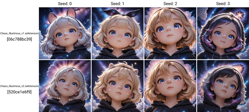
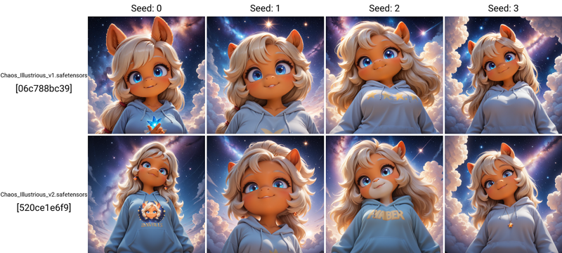
Image Comparison from the versions.
Best sampler combo's
Euler with Karras
Kohaku_LoNyu_Yog with Karras, Normal, Karras Dynamic, or Align Your Steps GITS
Seeds 2 DP with Karras, React Cosinusoidal DynSF, DDIM, Beta, PHI, Laplace, Align Your Steps GITS
Seeds 3 DP with Karras, Simple, DDIM, Align Your Steps, Beta, Turbo
HeunPP2 with Karras, Align Your Steps GITS
IPNDM_V with Karras
DPM++ 2M SDE Turbo (Does not actually use a scheduler so any work)
Sampler / Scheduler samples
(if you cannot zoom in on this image, open it in a new tab.)

Update v2.0 is out. It took me 6 months to complete and boy was it a pain. Do keep in mind that I was not able to get a de-facto 100% better version than v1.0 so I would recommend trying both till you figure out which one you like more.
Version 2.0 is focusing on more character concepts, characters, and solidification of the style more. I think users will find this version more cohesive with lora and other tools. Pictures posted are generally basic and not processed to the full ability of which it could. It drives me crazy when people add a billion lora and fancy processing steps to display image's as I feel its not an accurate representation of the model.
17/20 image's are using old / slightly modified prompts from v1.0 and MANY of these "enhancing terms" are no longer needed.
Version 1.0
Chaos Models merged from other checkpoint's and lora's to focus on magical effects and rings to attempt to fill a gap in what is currently available.
I normally release how this was made, but ill be honest, idk anymore. Somewhere between the merge blocks and hyper tuning I lost my document up to the 90% mark.
This model is based on sudo realistic items with a focus on mythical creatures and furry stuff.
NOTES: some feedback from private channels noted that some lora's based on Illustrious v0.1 may be over powered and you may need to run at lower powers.
Checkpoint is based on Illustrious v1.0 and may be overly sensitive to some keywords or tokens. I recommend starting simple and working up from there.
Recommend CFG 3.0-6.0.
3.0 will be softer than 6.0, but going above 7 may result in over processed looking pictures.
Resolution 1024 to 1536 tested and working fine.
Steps 20 for decent images, 30 is the sweet spot.
Should be fine with most samplers and schedulers. Didn't notice any major issues with random sample testing.
Prompting:
Some issues with the token "eyes" or "eye" noticed in testing. If eye quality is diminished, use "contacts" instead. I have also noticed that this also somehow improves hand quality as well. Idk either.
Example: green eyes -> green contacts
If using "ugly" in the negative, you may have issues generating some races and ethnicities or older / mature looking characters. I would recommend removing this from your negative if you are aiming for mature or realistic characters. I'm not sure why this is. I didn't train that.