Jim Aparo Style ('80s DC)
Details
Download Files (1)
About this version
Model description
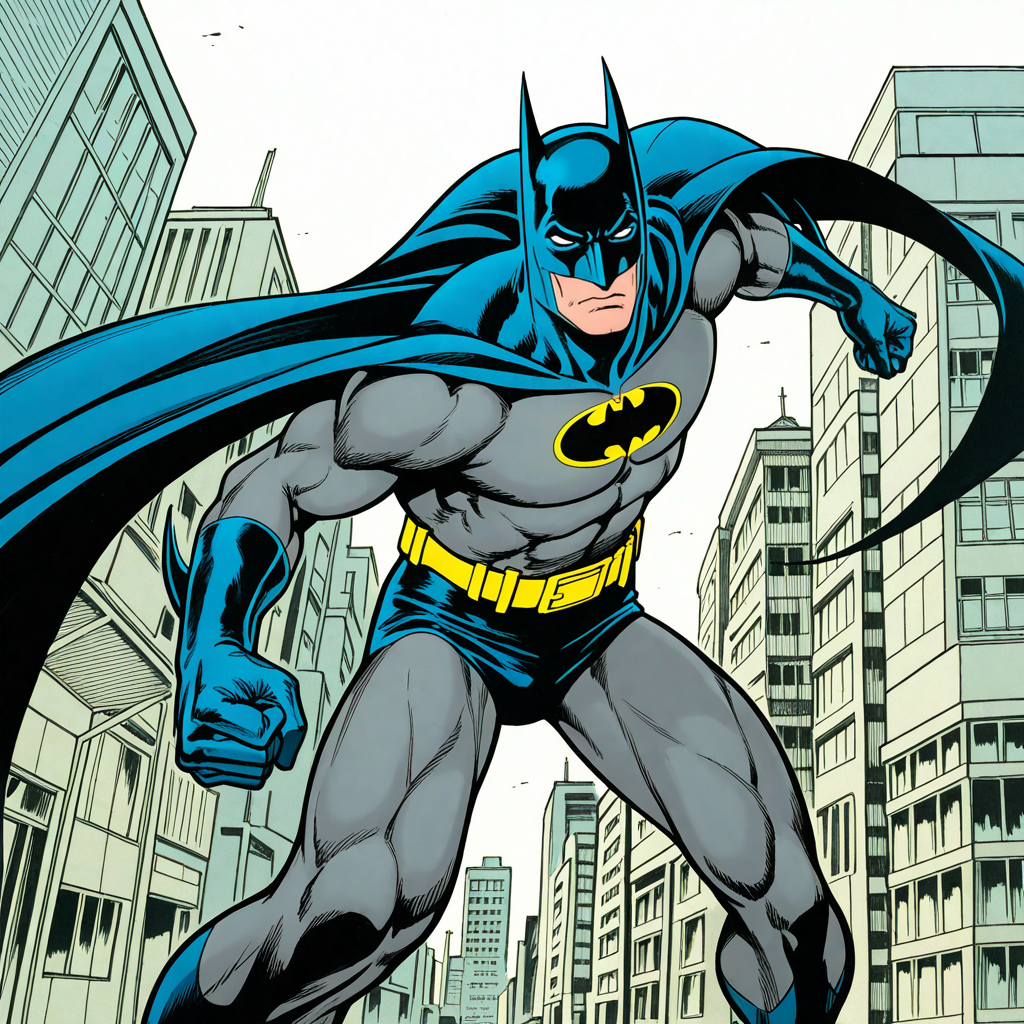
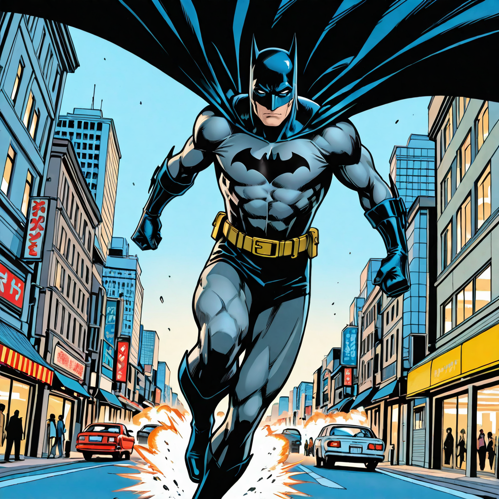
Neal Adams rightly gets the credit for creating the house style look for Batman in the '70s and '80s - a Dark Knight we could take seriously in the aftermath of the Adam West TV show while still dressing in powder blue. But it was Jim Aparo who held the torch throughout the '80s and well into the '90s, from Ten Nights of the Beast to Knightfall, with a sombre stop at A Death in the Family along the way.
Aparo's Batman was simple but expressive, and incriedibly versatile - he could look menacing or shocked, or express a wry sense of humour, and somehow the bridge of his nose was always in shadow, no matter the light source. With the lightest shade of blue his costume has ever been!
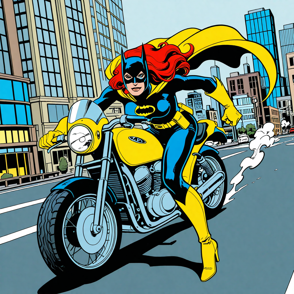
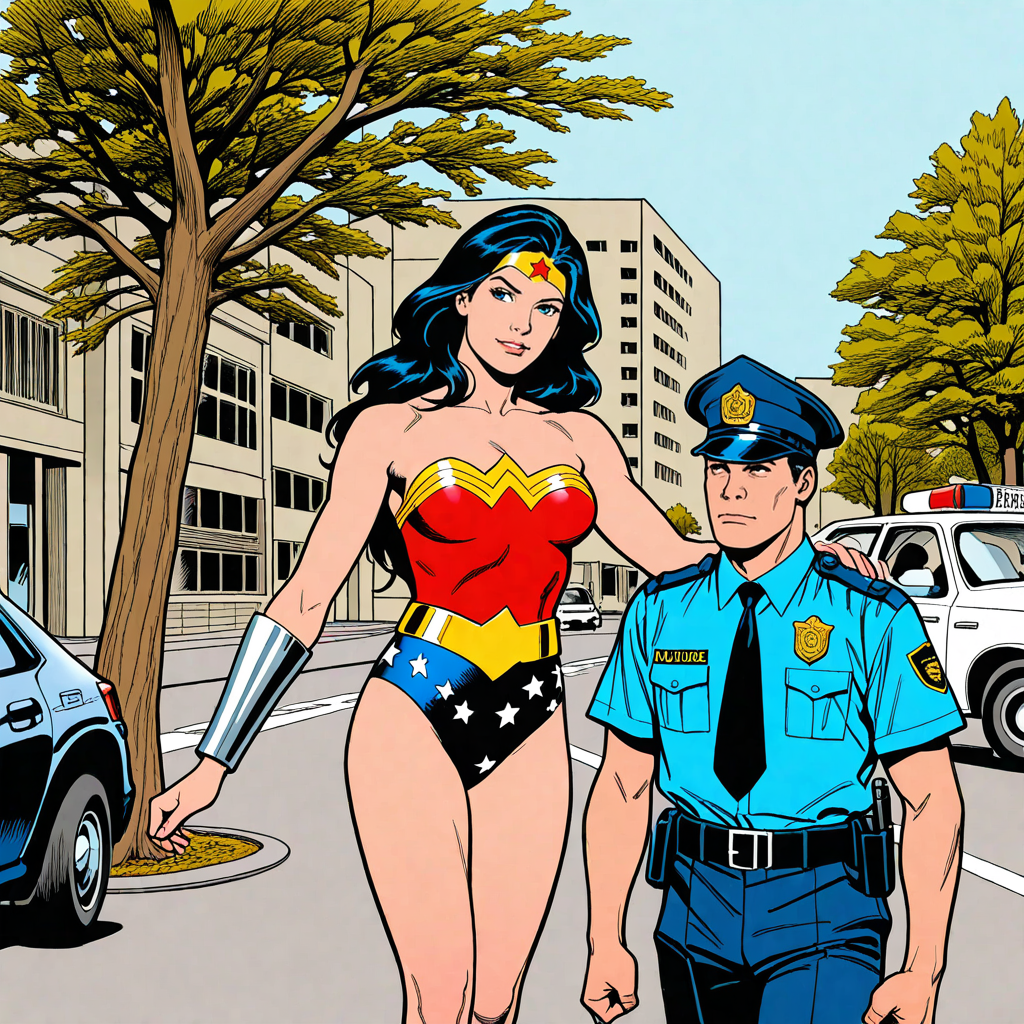
Jim Aparo wasn't just a Batman artist, of course (though by volume the overwhelming majority of his work featured the Caped Crusader) - he had a spin with Aquaman, a cup of coffee with Lee Falk's The Phantom, and of course The Brave and the Bold was designed to showcase its guest stars. This is a style LORA, however, so while it might have some inklings around the extended Bat-family and the original Outsiders, it's not built to faithfully re-create too much of DC's broader pantheon. Batman gets his own trigger word because he's the showcase guy, but that's it.
USAGE:
Keywords:
jimaparo: the generic style trigger. I find it's not entirely necessary.
aparobats: an intensifier to get Batman in his era-appropriate powder blue costume with the yellow bat-simbol (though see disclaimers in the Model section!). I find the combination of jimaparo, aparobats and character:batman is usually overkill, so play around with the three to find the right balance.
Other recommended tags:
To match the '80s style, try some permutation of the following in the positive prompt: western comics style, traditional media, crosshatching, old-school comic book dynamism, four-color process, four-color printing, linear hatching
In your negative prompt, throw in newsprint, faded, border or halftone if you're getting quality issues - though they do add verisimilitude if you genuinely want the output to look like it comes straight from an old comic.
Models:
Trained on Illustrious 2.0
For best results, use a LORA-friendly checkpoint like TewiNai
You can get some interesting style blends by using Western comics or illustration-friendly checkpoints like Simple Mutation Reflex or BrDrXL. However! These checkpoints usually have their own idea of what Batman should look like and will fight with this LORA, meaning you'll have real clashing problems when it comes to blue capes and the long-suffering yellow chest bat-symbol.
Strength:
1.0 is usually plenty if you're generating capes.
To get the full effect for civillians, go up to about 1.2.
To get a this-looks-like-a-real-comics-panel, warts and all, it caps out at about 1.8 (v2 only, you'll get border blurring in v1).
Detailers:
The showcase images are straight gens plus a face detailer. The face detailer is definitely recommended as characters start to get LORAface if they're not right up against the camera. However, I'll play the verisimilitude card here again - the actual faces as drawn in the comics tended to be at about that quality level.
Licence:
Ha, just kidding, do what you like.