Punk - Engel // ZIT


Details
Download Files (1)
Model description
Recommended LoRA strength: 0.85 - At least that seems to give me better results then just going full blast 1
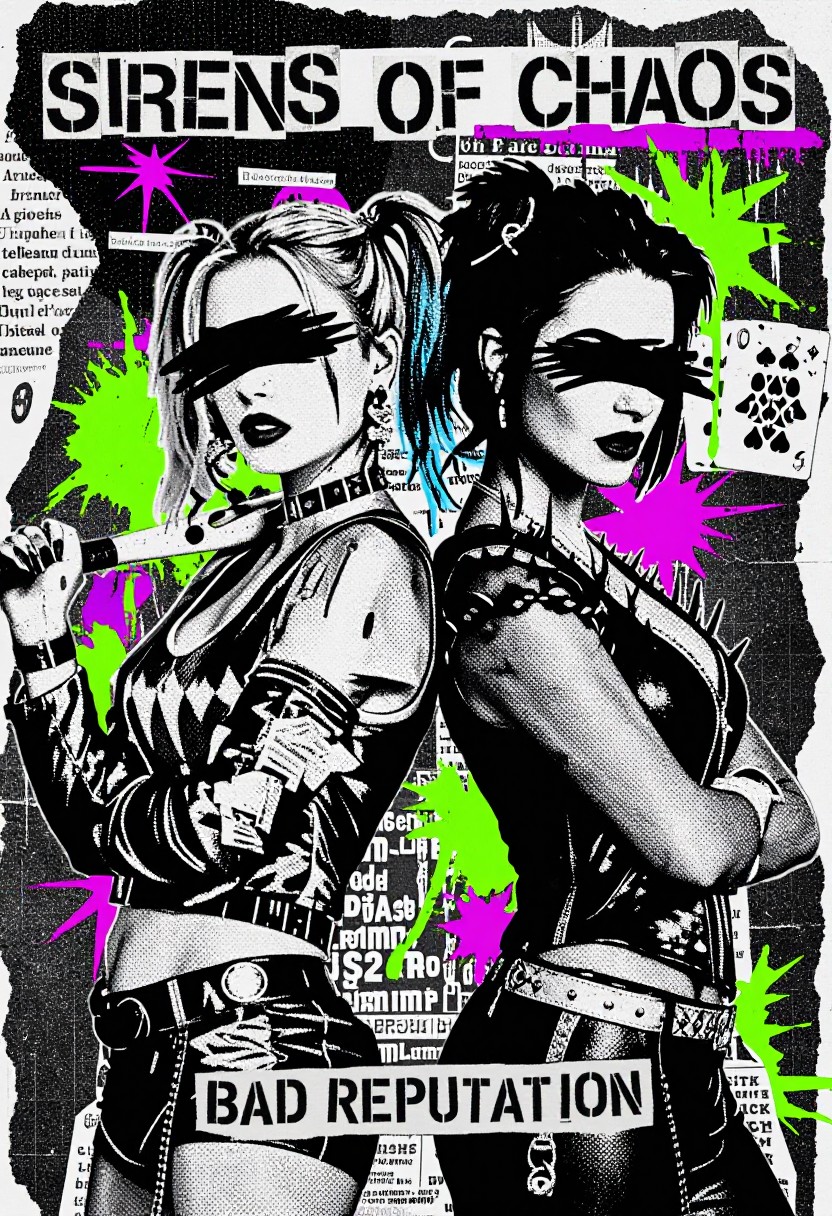
What does this model do? This LoRA brings the chaotic, high-contrast energy of 1970s and 80s punk fanzines to your generations. It applies a distinct "photocopy" aesthetic, mixing grainy halftone textures, newspaper clippings, and stark black-and-white ink work with splashes of vibrant CMYK colors (cyan, magenta, yellow). It turns standard subjects into rebellious, street-art style graphics.
What's it for? It's designed for creating album covers, poster art, t-shirt designs, and character portraits that need a gritty, anti-establishment feel. It’s perfect if you're lookin' to create art that looks like it was cut out with scissors, pasted together with glue, and run through a cheap copy machine a dozen times.
What is this model good at?
Textures: It excels at generating heavy halftone patterns, paper grain, and distressed ink effects.
Composition: It naturally creates "collage" style backgrounds using text fragments, newspaper headlines, and torn paper edges.
Contrast: It loves high-contrast lighting—deep blacks and bright whites.
Color Accents: It handles "spot color" very well, allowing you to add neon splashes (like the cyan and magenta in the examples) against a monochrome background.
What should it be used for? Use this when you want to rough up your clean digital art. It works great for:
Character portraits (skeletons, animals, punks)
Abstract street art
Retro concert flyers
Propaganda-style posters
What is this LoRA bad at?
Photorealism: This model is style-heavy. It is not intended for clean, realistic photography.
Subtlety: It struggles with soft gradients and delicate lighting; it wants to crunch everything down to bold shapes and dots.
Legible Text: While it generates aesthetic text blocks (like newspaper clippings), the actual words will mostly be gibberish "lorem ipsum" style shapes, not readable sentences.
How should it not be used? Don't use this if you are trying to generate smooth anime skin tones or hyper-realistic landscapes. It’s going to add noise, grain, and artifacts to everything—that’s the point! If you try to force it into a clean style, you'll just end up with a messy result that doesn't look quite right.